The Timeless Design of Letterboxd
The fate of Letterboxd, the social network for film watchers, is uncertain. Will The New York Times buy it? Will Netflix, or Paramount, or Sony? We don’t know. And while we wait to find out, I wanted to celebrate something I’ve taken for granted about them.
In the fifteen years since it launched, Letterboxd has never redesigned. Their iOS app has also kept its original look for the whole decade it’s been around. That’s not due to inertia or the Amazon-like paralysis at the thought of touching a hopelessly busy product. It’s simply that Letterboxd has always been well designed, and it still is.
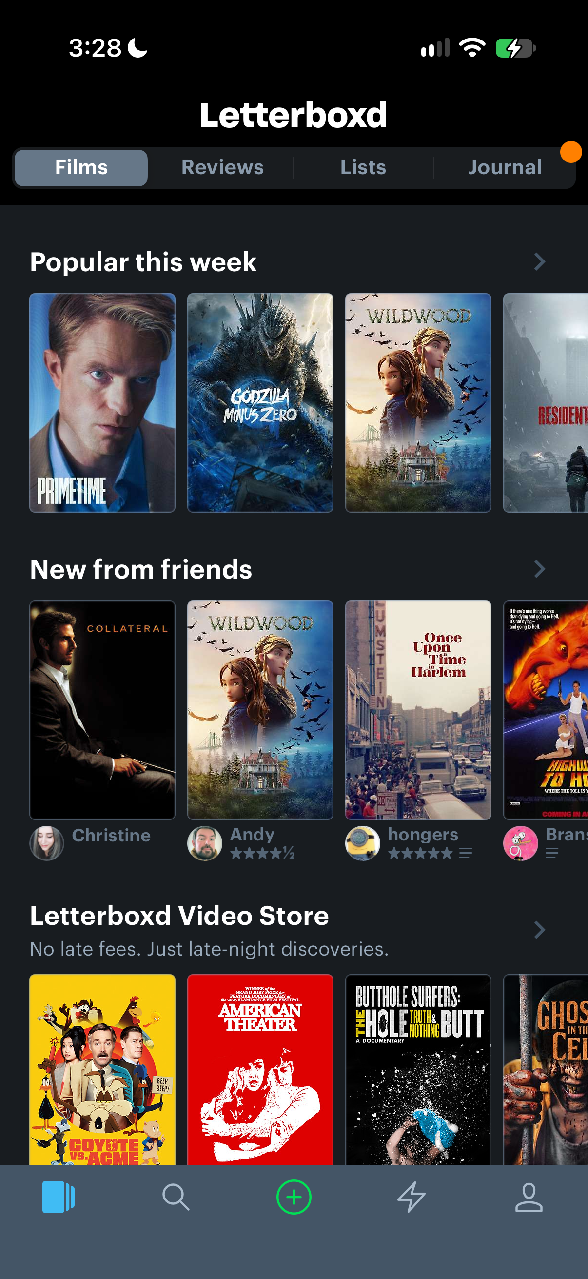
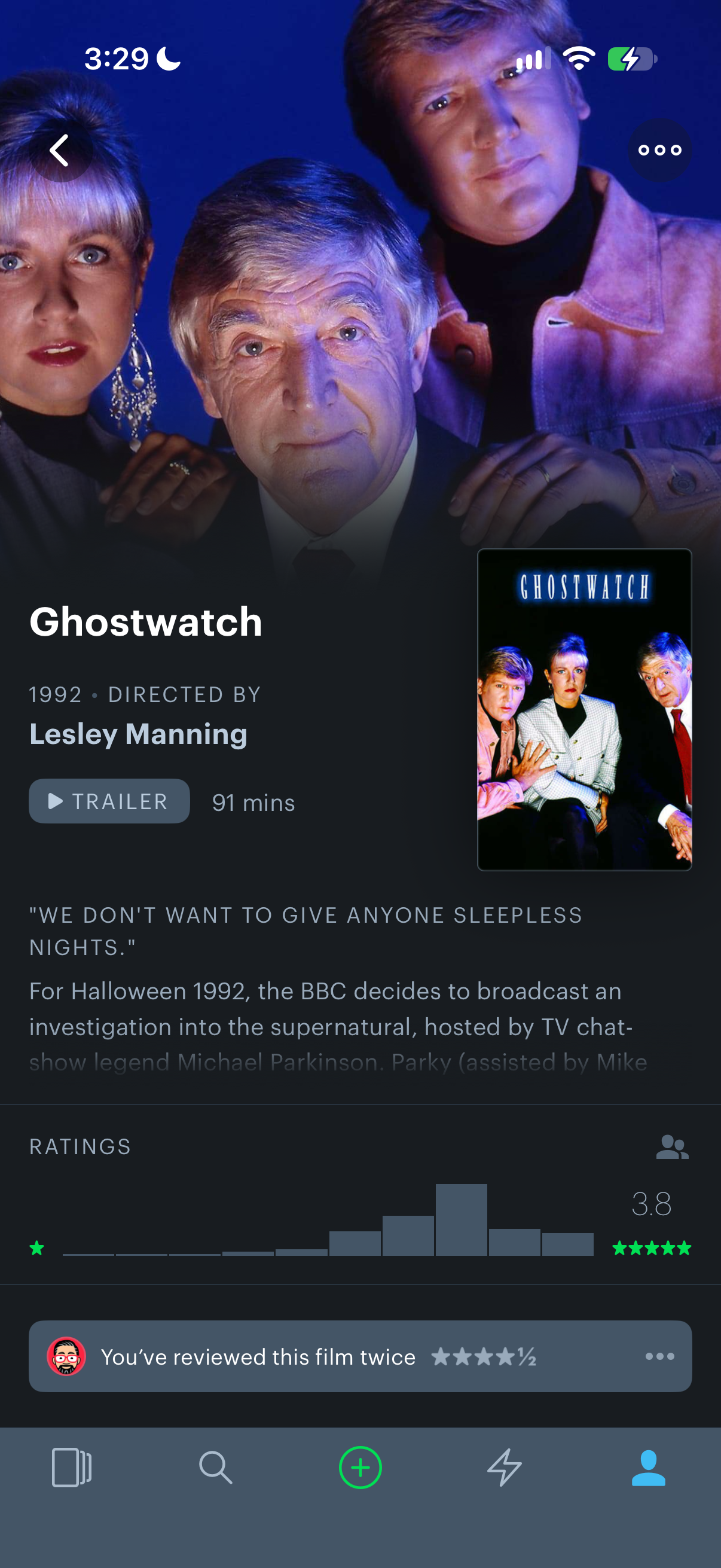
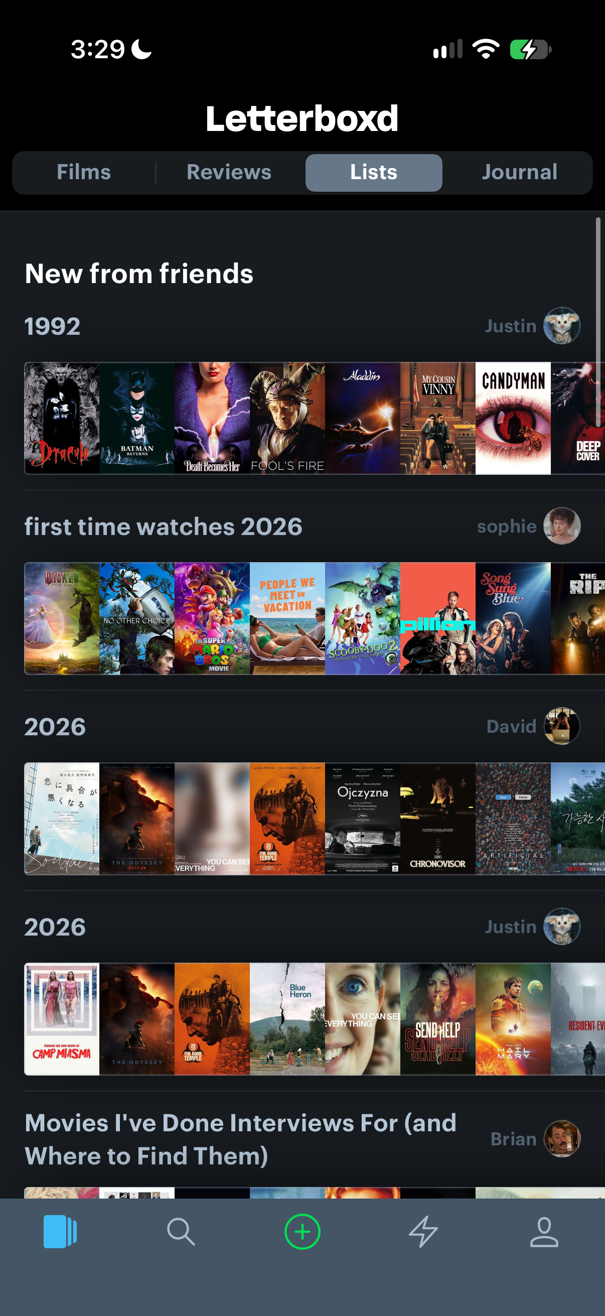
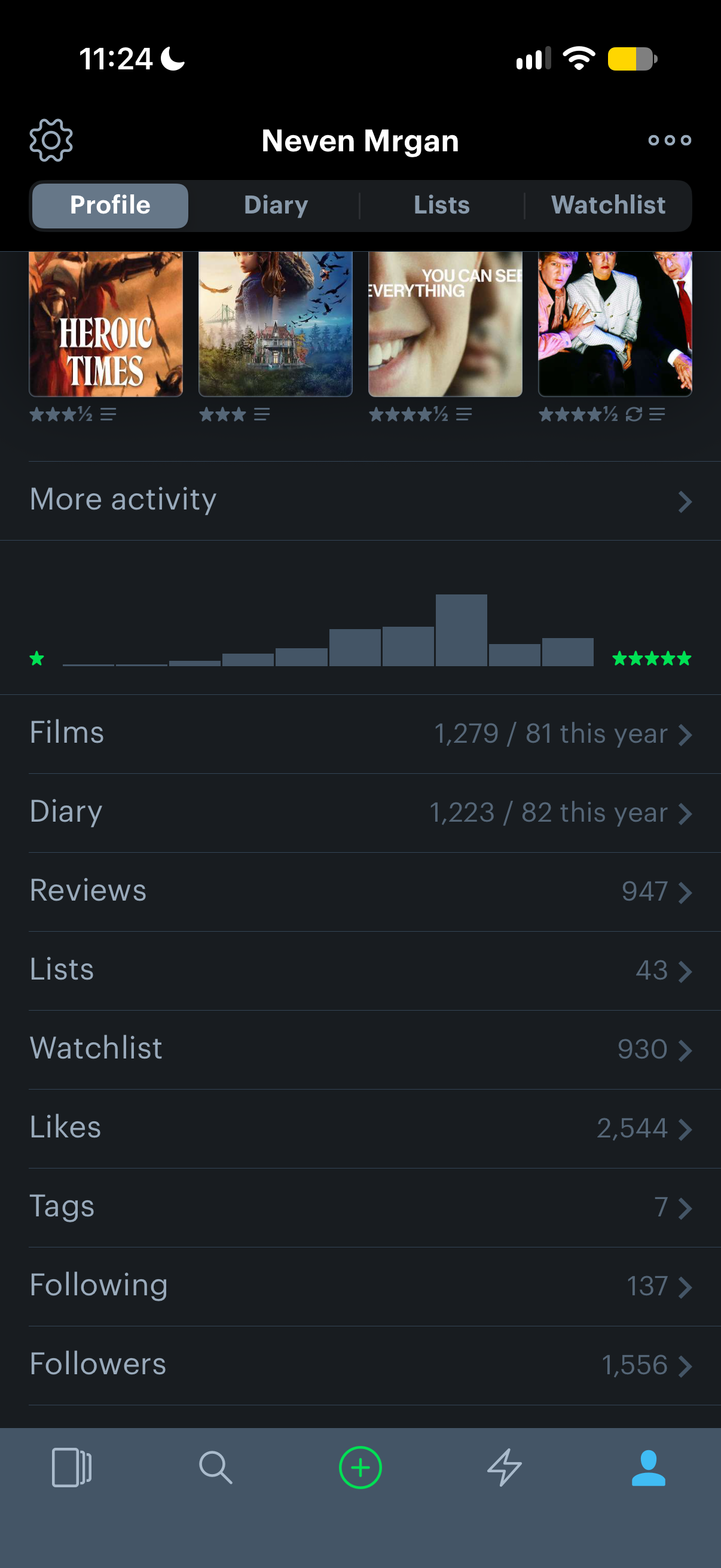
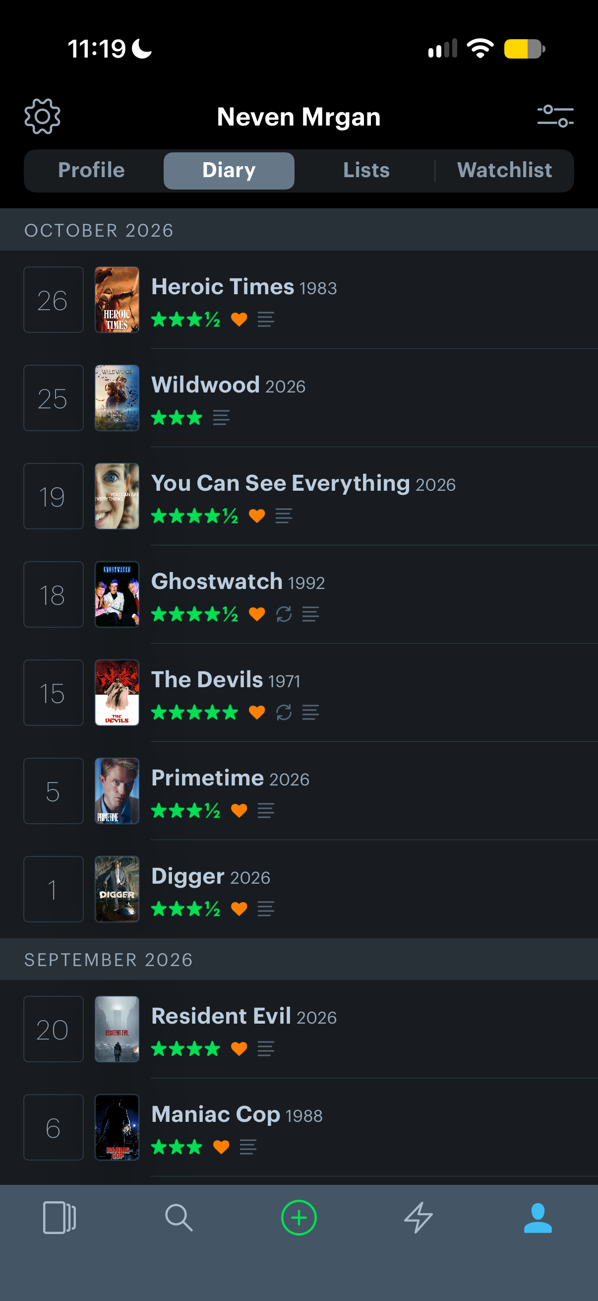
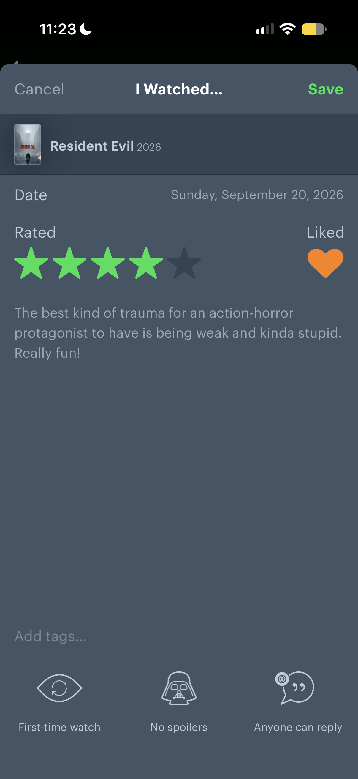
Compare Letterboxd’s design tenets to the trends that have swirled around iOS in that decade:
- There are no floating elements. The top and bottom bars are real toolbars.
- There are no see-through controls. Even with the less-than-maximum contrast between the brand grays, UI elements are clearly separated.
- There’s little doubt about what’s an interactive control.
- When a view is a form with many fields (the film-logging interface), they are separated by rules. Apple’s tendency lately has been to put things in generously rounded boxes, and then also separate the boxes themselves. This sacrifices far too much real estate.
- Data density is high. Before you even scroll a movie’s page—the top third of which is given over to key art!—I count seven interactive elements (Back, More, Poster, Director…) and eight data labels (year, length, synopsis…).
- The more nitpicky design concerns are handled deftly: the metrics and layouts are consistent and handsome, the hierarchy is clear. It just looks good.
Lots has changed about the iPhone, iOS, and user behavior over the past decade, but nothing about this app “needed” redesigning to stay functional. And it’s not like they’ve simply abandoned the product; they’ve added major new features, like a video store, a magazine, rich stats. On top of all this, the app matches the website perfectly (as far as I can tell, this is largely a native app, not a wrapped website).
It used to be a badge of honor to make your app feel at home in its OS; this still holds true in many technical ways. But when it comes to the visuals, it has always seemed to me that doing good work beats marching in step with trends. Letterboxd of course isn’t the only app choosing to stick to their own established brand; I just think they do it more broadly and confidently than most. Even companies with titanic visual identities like IKEA and Target end up shipping apps with this year’s flavor of floaty, blurry toolbar.
Good luck to Letterboxd, whatever ownership they end up under next. I hope they stay faithful to this one idea: staying faithful to themselves.